18 Thanksgiving Decorations Table Setting Pairings That Last
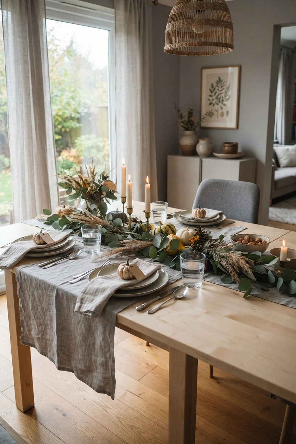
Dry linen has a slightly nubby grain under your palm, and on a gray November afternoon around 4pm it reads as a different color than it did in the store. That shift explains most of what makes a good thanksgiving decorations table setting: undertones decide everything, and your dining room light decides the undertones.
Below are 18 palette and undertone pairings, each with the reasoning, the room it suits, and the one trap to dodge. Trendy combinations are treated with suspicion here, because a palette that needs this year’s fashion to look right won’t survive next year’s.
The color logic behind a great thanksgiving decorations table setting
A thanksgiving decorations table setting works when every piece shares an undertone family, either warm (yellow, red, or brown underneath) or cool (blue, green, or violet underneath). Mix families without meaning to and the table looks off, even if nobody can say why.
The most common early mistake is buying one fashionable color in every category: tablecloth, napkins, candles, and plates, all in this season’s it-shade. It backfires because the set is stuck. It can’t be reused for Christmas, a Tuesday supper, or a different color scheme once the trend passes, and a full matching set bought in one color tends to date-stamp the room within two seasons.
Here’s a counterintuitive fact worth knowing. Candlelight burns around 2200-2700K, so it pulls blues toward gray and pushes white plates toward cream. Cool colors lose the most, so test them under real light before you trust them.
These 18 pairings lean on durable, repeatable combinations. Each can be rebuilt from pieces you’ll use again.
1. Rust linen runner on a walnut table
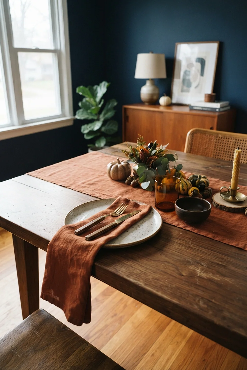
A 14-inch-wide rust runner does two jobs on a walnut table. It takes the heat from platters, and it gives the eye a warm place to land. A stone-washed linen length of about 90 inches runs $35-60.
Rust carries brown inside its orange, which matches walnut’s red-brown undertone instead of arguing with it. That makes the pairing a sound choice for households that really use the table, since washed linen hides wrinkles and a red wine splash blends into the weave. Skip anything under 12 inches wide, because a skinny runner reads as a ribbon rather than a foundation.
2. Olive stoneware against unbleached cotton
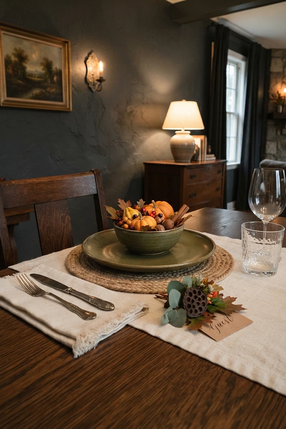
Olive-green plates with a matte, slightly chalky glaze look best next to a cotton cloth with visible slubs. The contrast in surface does the work a bold pattern usually fakes. Olive is a yellow-green, so it needs an off-white with a little yellow in it; a blue-white cloth turns the plates muddy.
Choose this for casual family tables where plates get stacked and scraped. Check the glaze before buying. A glossy, dark olive 10.5-inch plate reads closer to a garden hose than a leaf, and crackled glazes hold onto gravy stains.
3. Navy napkins and brass flatware
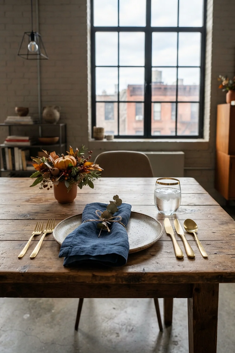
A rectangular table between 72 and 90 inches gives each place setting about 24 inches of width, which is the spacing where navy and brass behave best. A deep navy such as Benjamin Moore Hale Navy lets brass read as warm rather than yellow.
Navy is the most forgiving dark color on this list because its cool undertone balances the warmth of candle flames. The trade-off is lint. Dark cotton shows every thread, so give it a lint roller pass the afternoon before. And hand-wash lacquered brass, because the coating peels in dishwashers.
4. Burgundy napkins over a blush-beige cloth
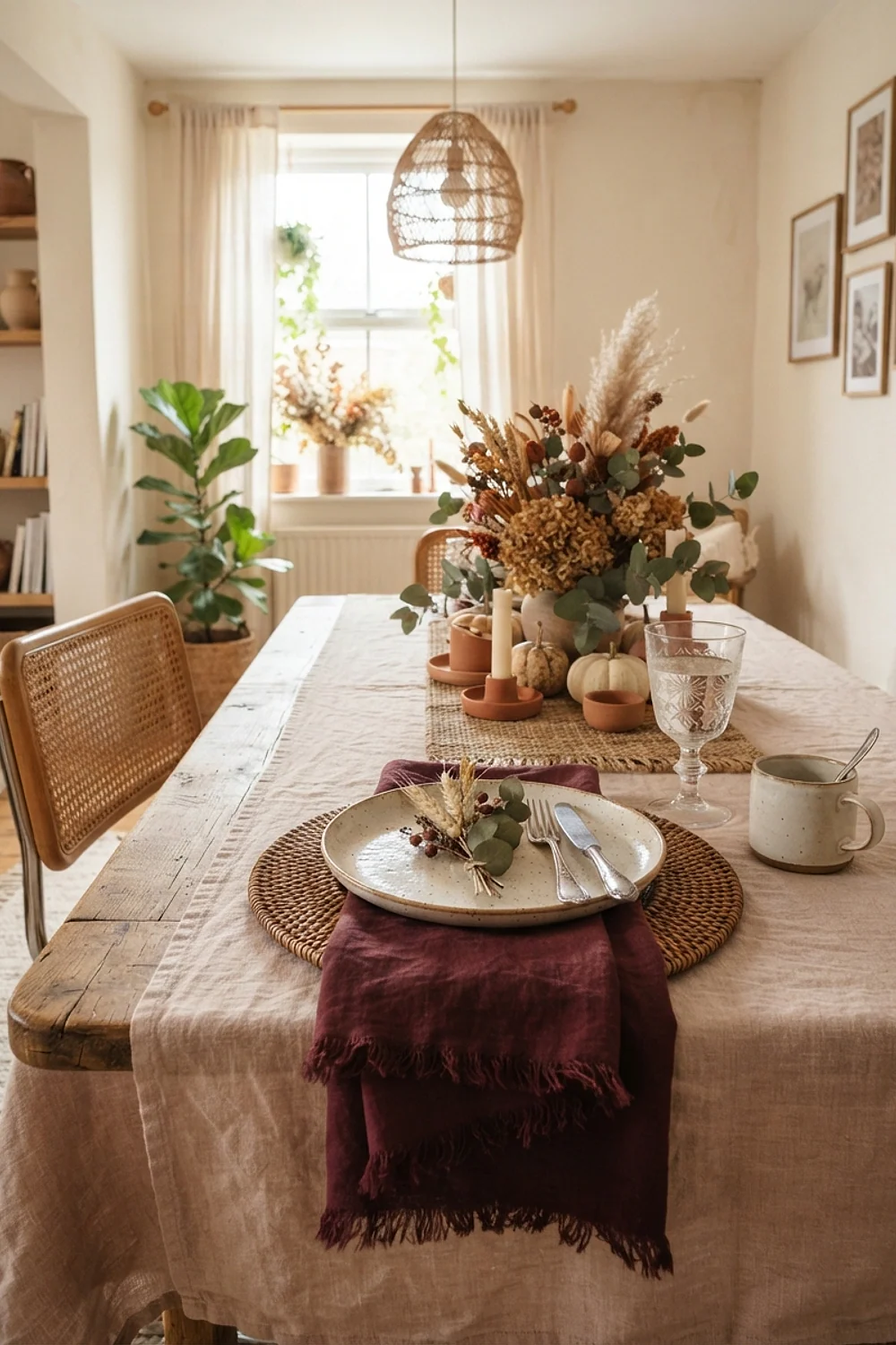
Burgundy changes more under candlelight than any other color here. At roughly 2200K, a taper flame pulls wine reds toward brown and softens them, which is why a blush-beige cloth underneath stops the table from turning murky after sunset. A 12-pack of 10-inch tapers costs about $20.
This is the pairing for evening-heavy hosts and dim dining rooms. Avoid bright overhead LEDs at 4000K, which flatten burgundy into dull maroon. Dim the overheads or switch them off once the candles are lit.
5. Ochre goblets on charcoal placemats
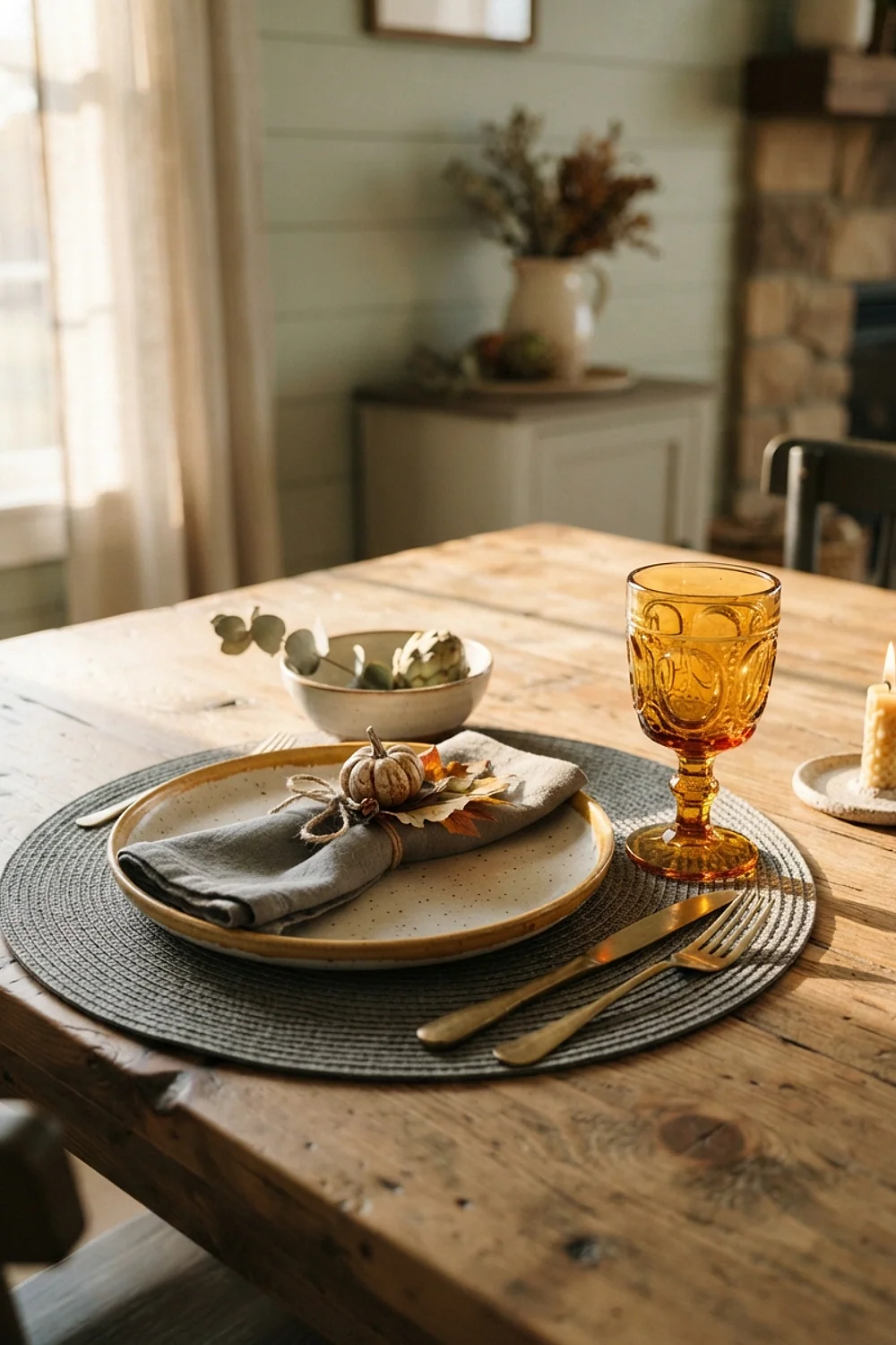
Ochre glassware against charcoal placemats sets up the strongest light-dark contrast in the whole list. Charcoal such as Benjamin Moore Kendall Charcoal is a warm gray that doesn’t tilt blue, so the yellow-brown of the ochre looks like gold instead of mustard.
It suits modern rooms with white walls, where the table has to supply all the contrast. The catch is fingerprints. Ochre glass shows every smudge, so buy goblets with ribbing or texture and keep a microfiber cloth on the sideboard.
6. Sage napkins with terracotta bowls
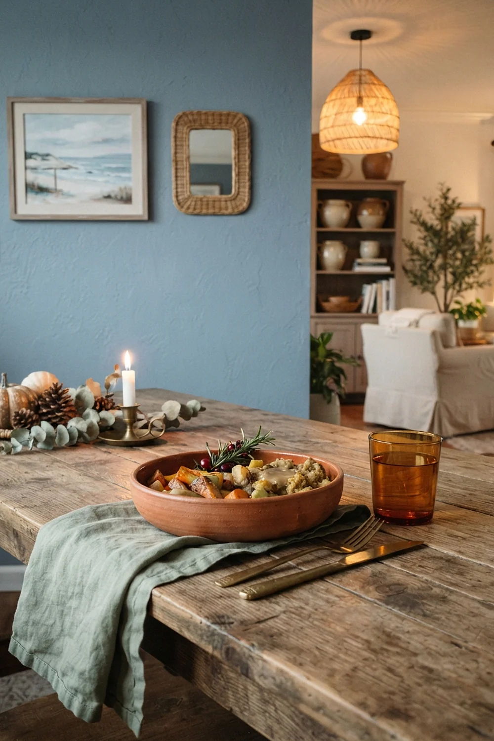
Terracotta bowls and sage napkins earn their place by living in the cabinet all year. Lightly glazed clay stacks flat on a 12-inch shelf without chipping, and the colors work for a spring brunch as easily as November. A soft green like Sherwin-Williams Svelte Sage reads gray-green in low light, which calms the orange clay.
But this is also the pairing most tied to recent years, so keep the volume low. Two or three pieces per setting beat a full matching set, which looks dated faster than any other combination here.
7. Chocolate velvet cushions with cream place settings
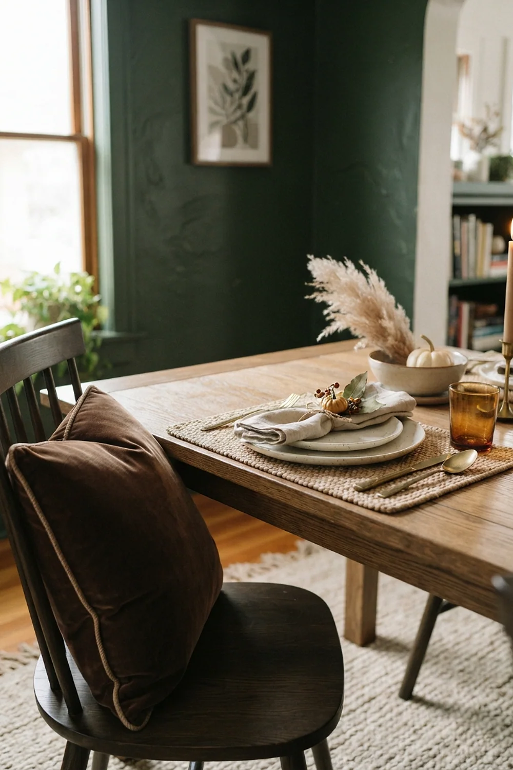
A chocolate-brown velvet cushion on each dining chair, about 16 inches square, turns a two-hour sit into something nobody complains about. The pile catches light and deepens the brown, while cream plates above keep the table from sinking into the chairs. Slip-on covers cost about $25-35 each and wash separately.
This suits hosts with hard wooden chairs or older guests. Tight-pile cotton or cotton-blend velvet is sturdier than cheap polyester, which sheds and shines where bodies rub it.
8. Pale greige cloth with white pillar candles
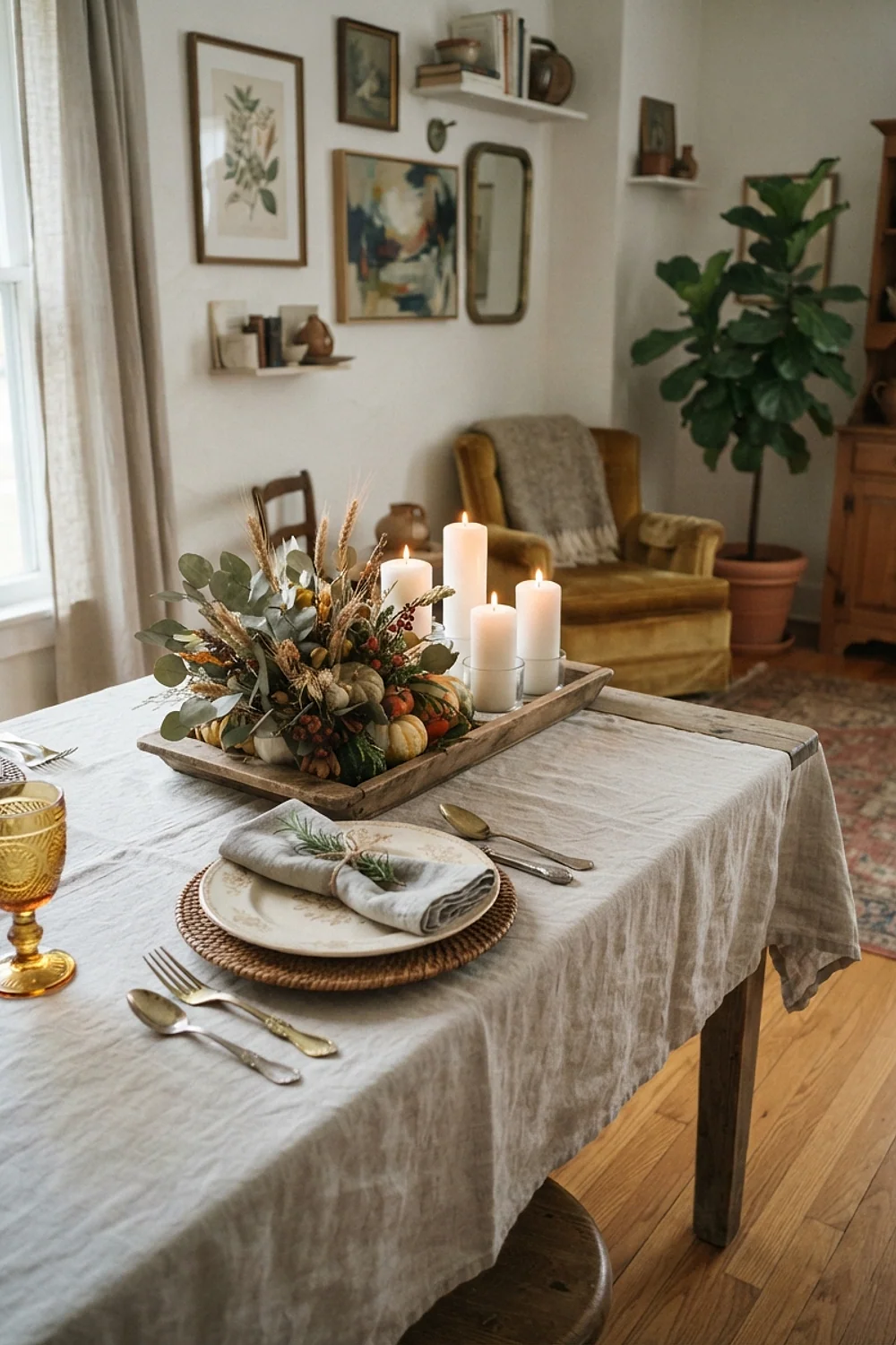
Three pillar candles, 3 inches wide and 9 inches tall, on a pale greige cloth tell the eye the table is calm. Greige such as Benjamin Moore Pale Oak sits between warm gray and beige, so white plates and bone candles both look intentional.
Skinnier tapers disappear on a 40-inch-wide table, and tiny votives look like confetti. Keep anything tall under 12 inches so guests can see each other. This works especially well in small apartments where the dining table doubles as a desk and has to reset fast.
9. Wheat gold bundles tied with forest green
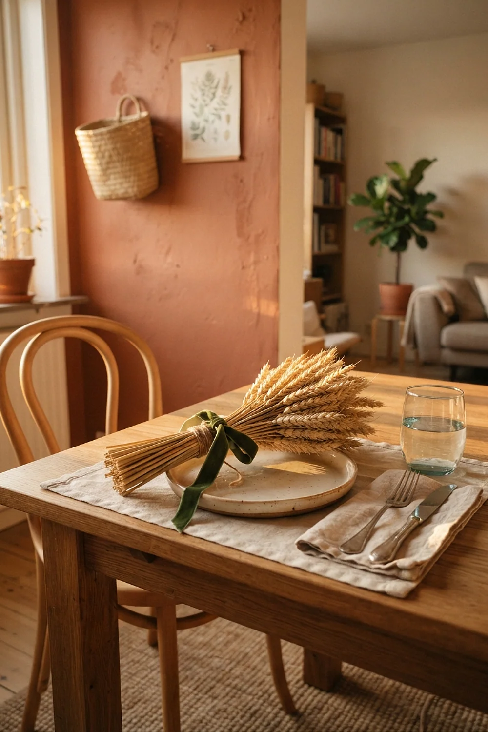
Dried wheat stalks tied in bundles of about 12 with forest-green ribbon read as harvest without a single plastic gourd. Wheat is a muted gold with a cream cast, and a very dark green such as Benjamin Moore Salamander makes it glow by contrast.
It’s a good fit when you want the table to look generous without buying much. Dry stalks shed, so tie them tightly and lay them on a runner rather than bare wood. Fresh-cut stems wilt within four hours, so skip them.
10. Gray-blue cloth with copper accents
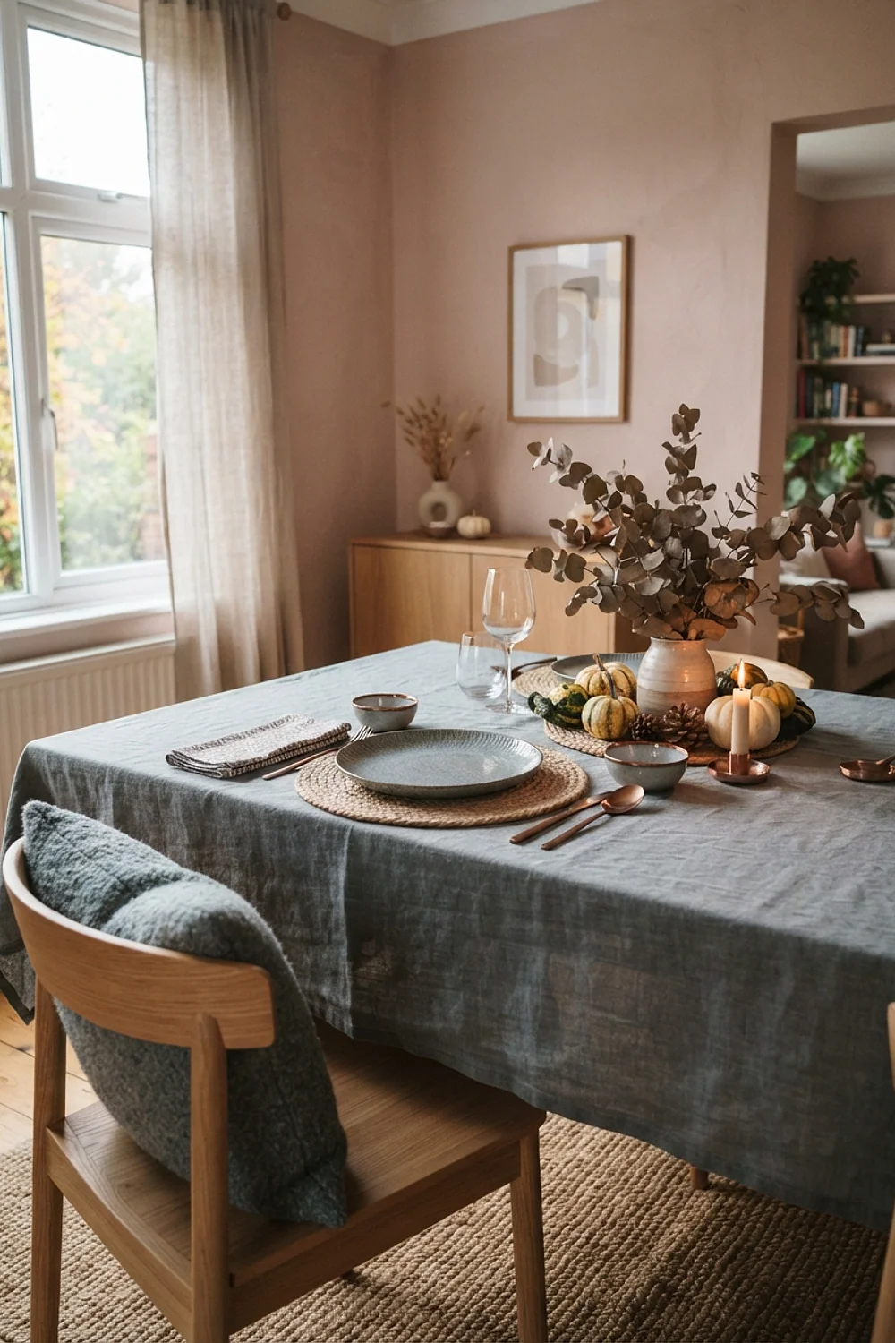
Mixing cool and warm undertones by accident is the most common color error on a holiday table, and a gray-blue cloth with copper pieces is the fix when done on purpose. A warm cream plate on a cool blue-white cloth makes both look dirty. A muted blue-gray like Farrow & Ball Pigeon lets copper be the only warm voice.
Limit copper to three pieces, such as two candlesticks and a bowl. More than that and the metal takes over the table.
11. Plum napkins with gold-rimmed glasses
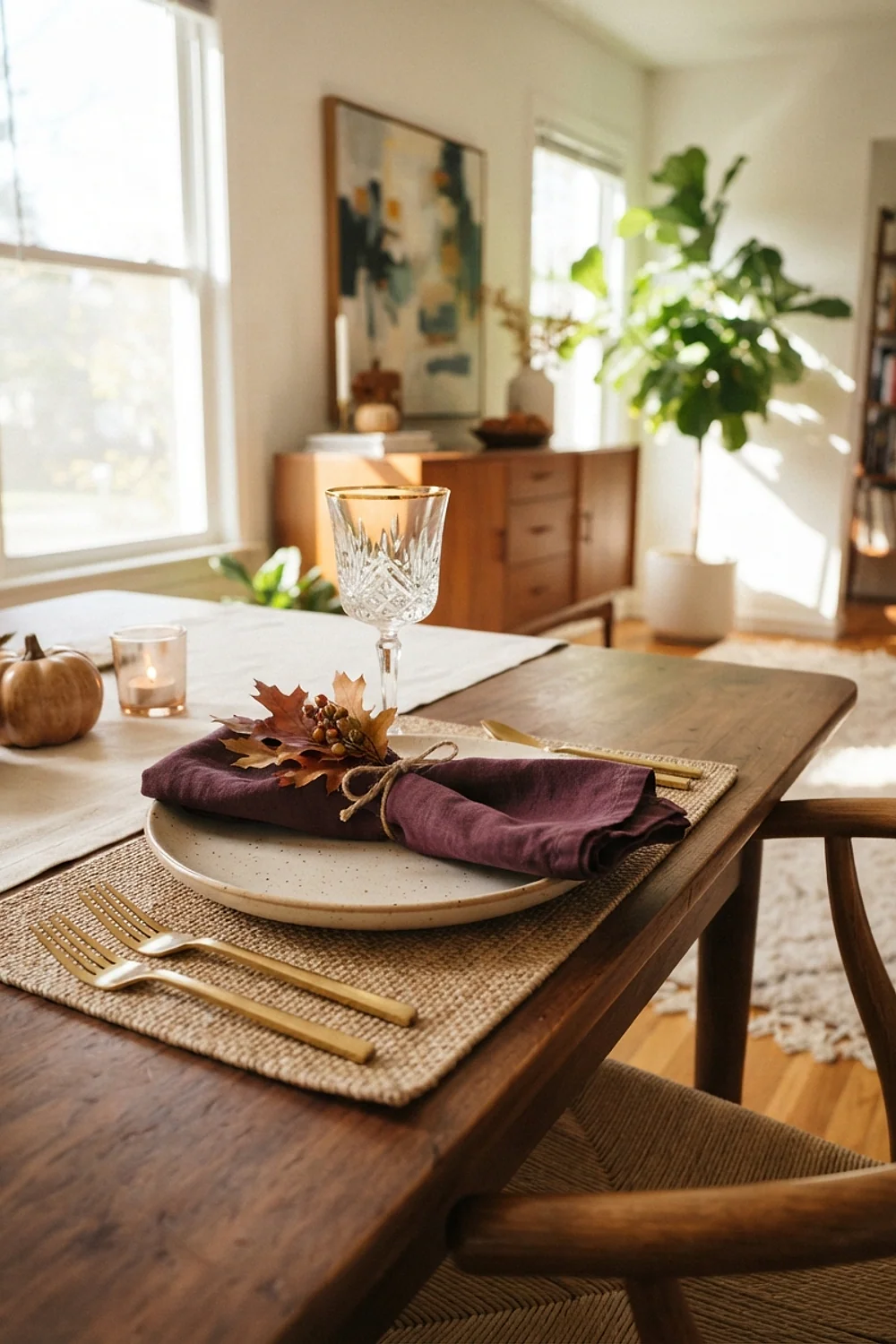
Plum napkins with gold-rimmed glasses suit a table that doubles as the buffet, because the deep purple hides drips and the metallic rim catches light without demanding polish. Plum is red-violet, so it needs warm gold. Silver makes it chilly.
Pick this for evening dinners in rooms with dark walls. In a bright white room, plum can read as a bruise. Hold a napkin next to the window at noon before committing.
12. Matte black plates, ivory linen, one orange pumpkin
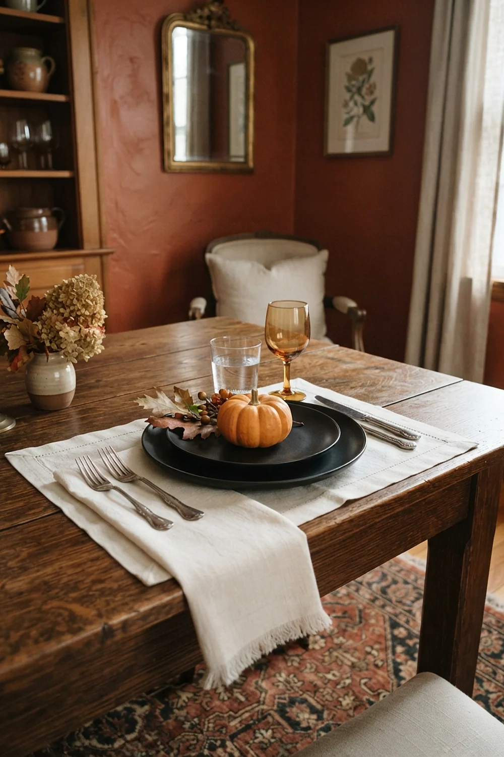
Matte black stoneware plates, ivory linen, and a single orange pumpkin per setting look designed without any fuss. The matte glaze matters. Glossy black picks up window reflections and shows every fork scratch, while matte hides both. Expect $12-20 per plate at mainstream retailers.
It suits modern, high-contrast rooms and hosts who don’t want to repaint anything. Limit orange to one object per place. A second one tips the table toward costume.
13. Teal and rust on a round table
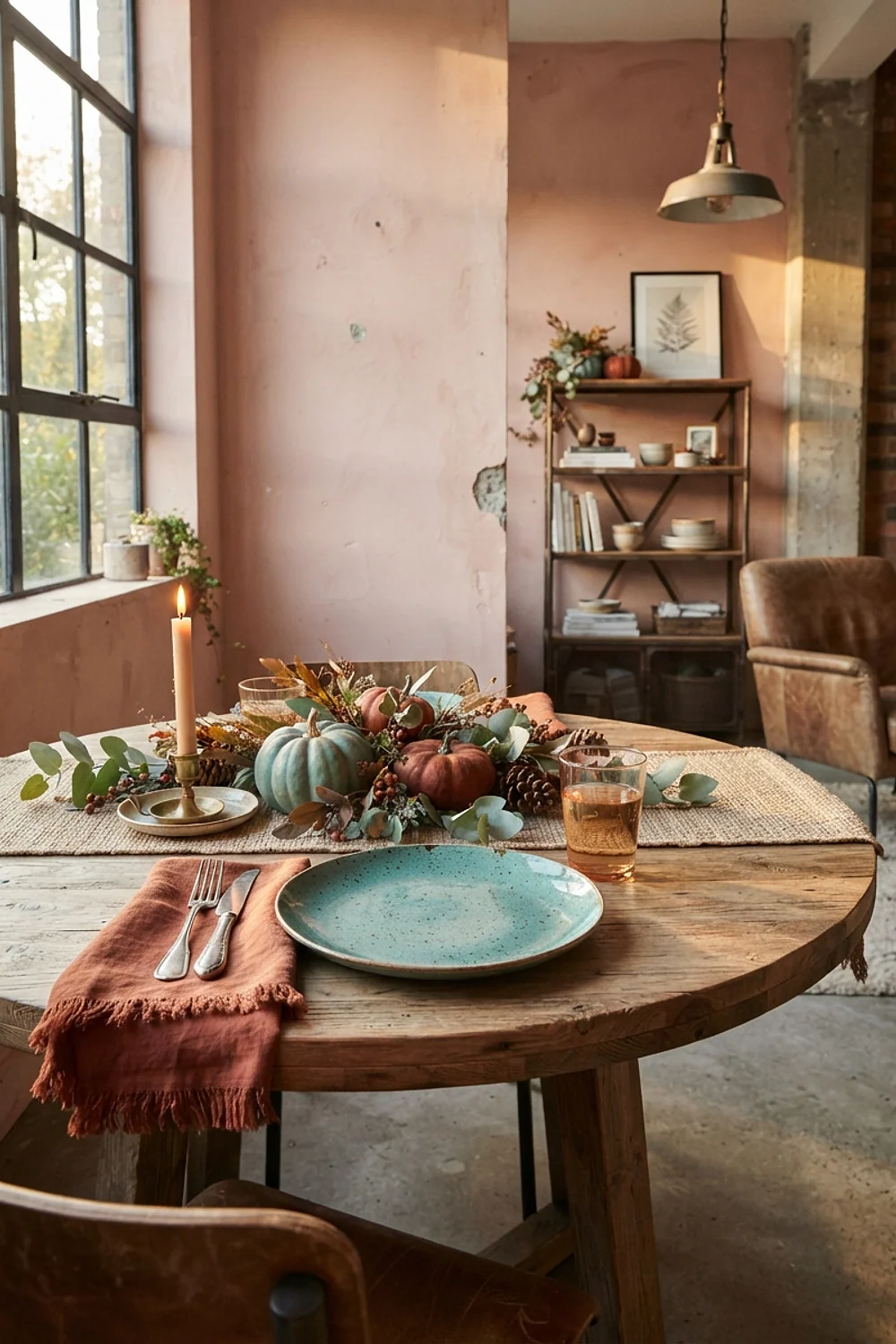
A 60-inch round table seats six comfortably and gives teal and rust a place to meet at the center. Teal and orange-brown sit opposite each other on the color wheel, so each makes the other look more saturated. A mid-depth teal like Benjamin Moore Aegean Teal handles this without shouting.
Let one color lead. Rust napkins with a teal centerpiece bowl look balanced, while a 50/50 split looks like a team uniform. Avoid bright turquoise, which fights the rust.
14. Five shades of cream, layered
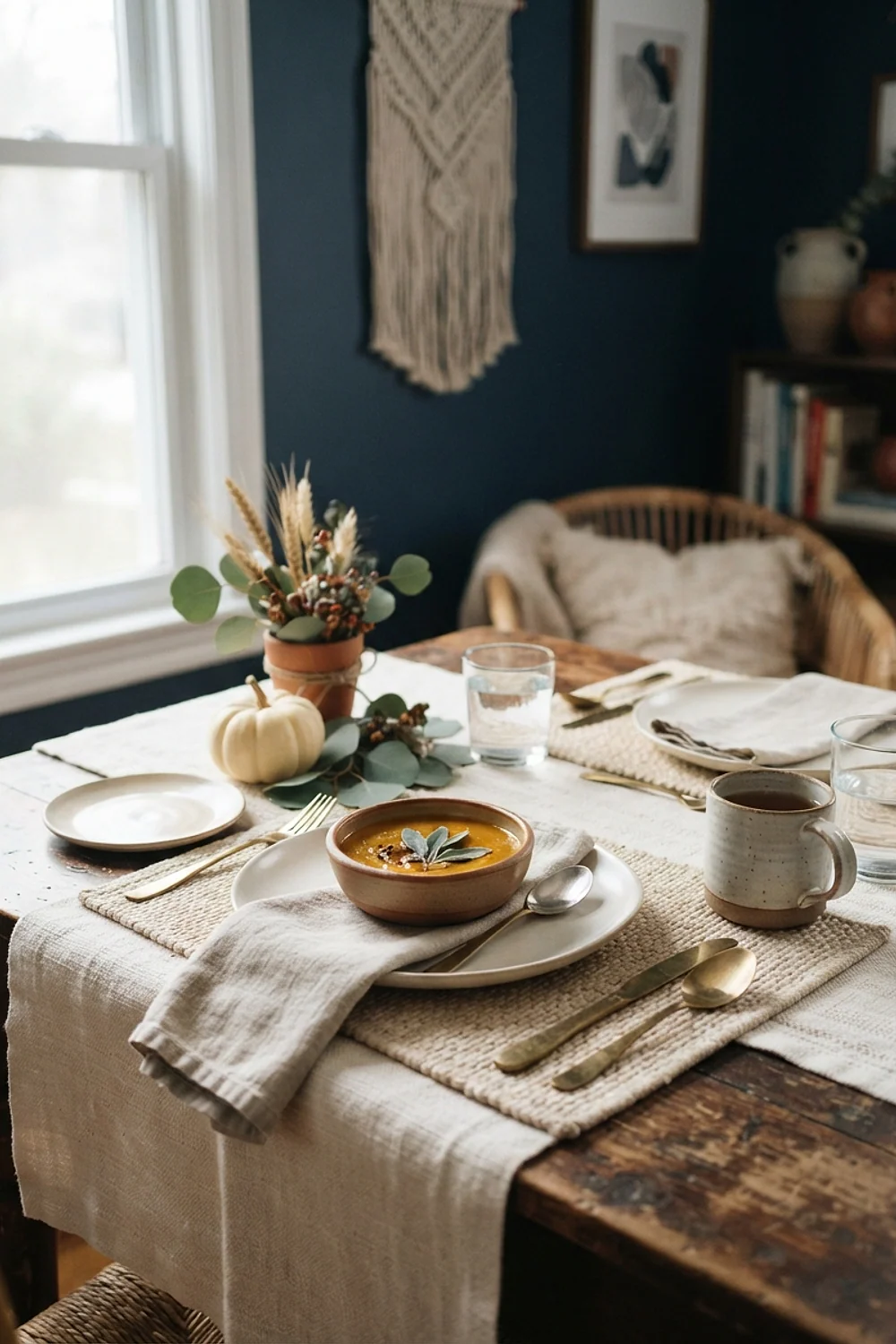
Cream tones from oat to bone look flat in morning light and come alive around 4pm, when low sun rakes across linen and exposes each shade’s undertone. Layer a bone cloth, an oat runner, and ivory plates, then add wax and ceramic for texture.
This is best in dining rooms with strong west or east light, and it fades in north-facing rooms. Keep at least two textures in play. A single flat paper-white against cream makes the cream look yellow.
15. Dusty blue and mustard
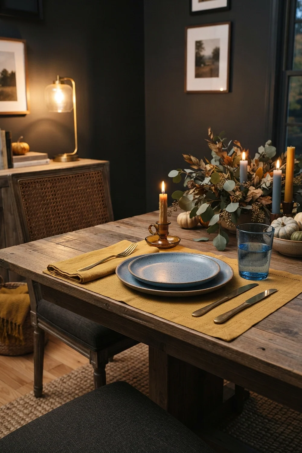
Dusty blue chargers under mustard napkins make a pairing that sits close to complementary on the color wheel. A muted blue like Benjamin Moore Wythe Blue keeps the yellow from feeling harsh, and the combination is old enough to avoid any trend cycle.
It suits farmhouse and cottage rooms with painted wood. Choose a mustard with orange in it. Greenish mustard looks sour next to blue and makes the whole table feel unwell.
16. Pewter chargers with wine goblets
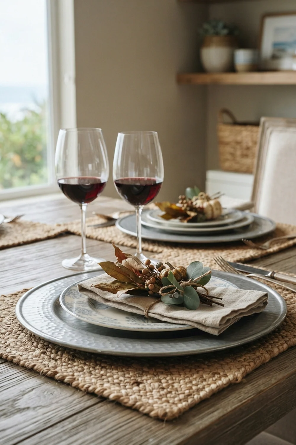
Pewter-gray chargers and wine-red goblets nest into one 12-by-12-inch crate, which makes this the easiest pairing to store between holidays. A set of four chargers runs about $30. The gray recedes, so the wine color looks deeper than it is.
This works for hosts with limited cabinet space or anyone entertaining year-round. Look for chargers in brushed rather than mirror-polished finishes, since mirror metal reflects the whole room and competes with the glasses.
17. Apricot napkins and chestnut wool throws
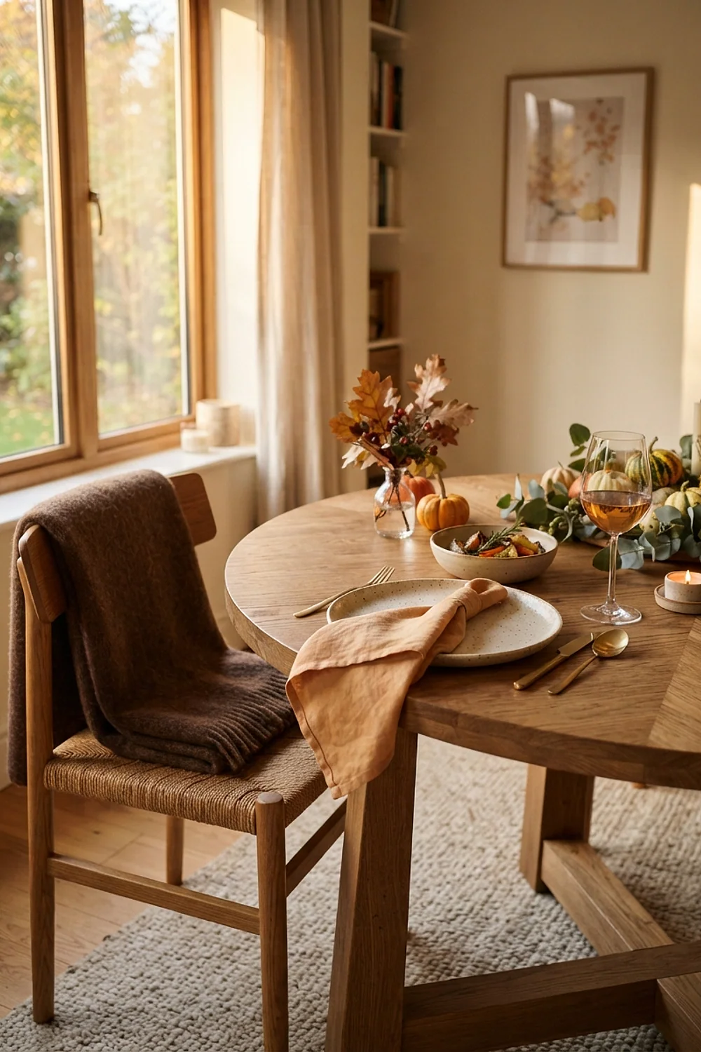
Chestnut wool throws over chair backs give guests near a drafty window something to pull over their shoulders, and the brown anchors soft apricot napkins on the table. Wool has a dry, slightly scratchy weight that cotton can’t match, and it deepens the warm colors beside it.
This suits cold-climate homes and November evenings when the radiator is losing the fight. Choose throws at least 50 by 60 inches so they actually cover a lap. Apricot is easily washed out by cool bulbs, so keep lighting at 2700K.
18. Taupe cloth with tall matte black candlesticks
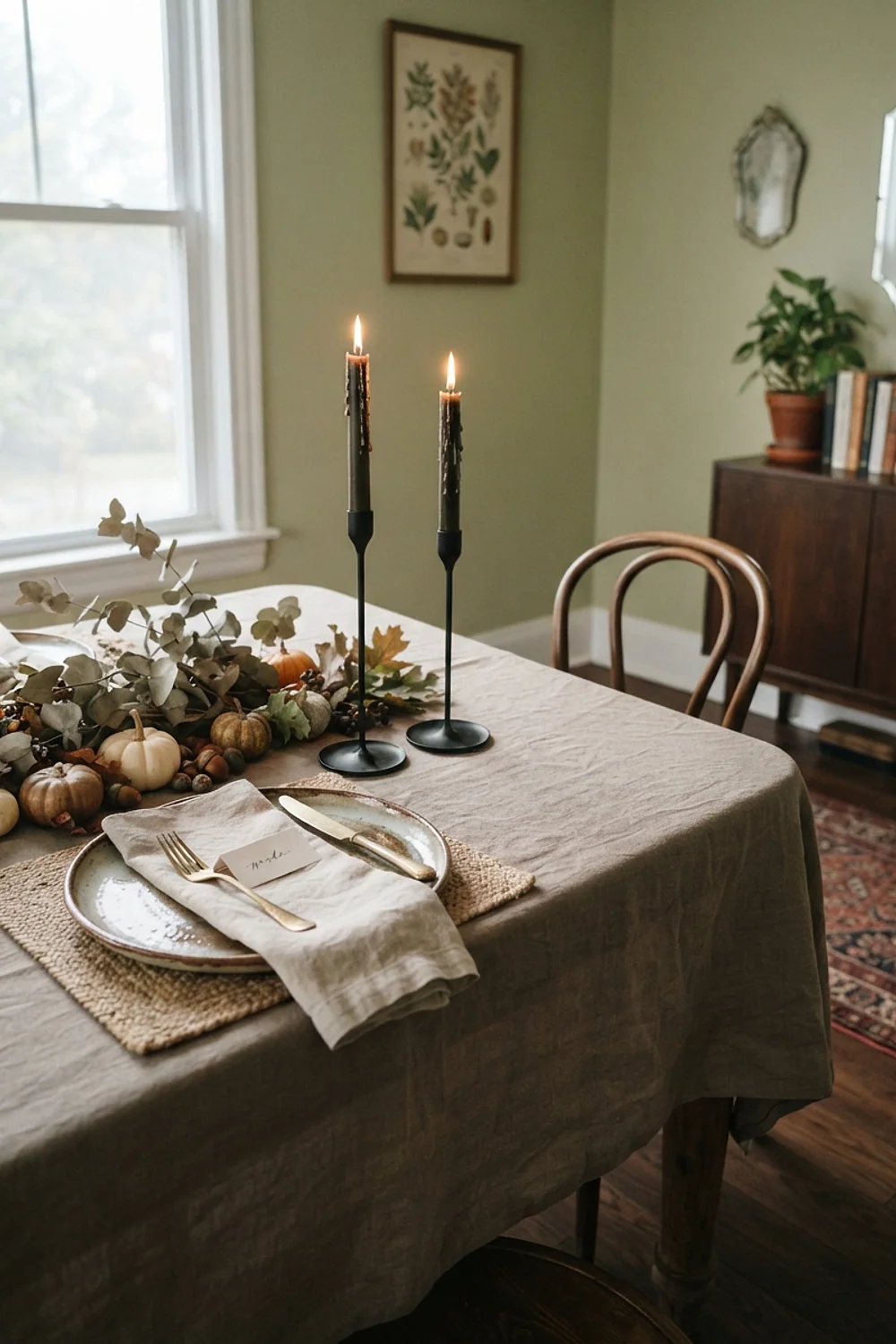
A pair of 16-inch matte black candlesticks against a taupe cloth like Benjamin Moore Weimaraner makes one confident gesture. Taupe is a gray-brown that reads warm, and the black gives it edge without needing a second accent color.
This suits long tables over 8 feet, where small pieces get lost. Fewer, larger objects beat ten little ones. But keep the candlesticks at least 6 inches from the nearest napkin, or the flames become a hazard.
Testing colors before you commit to a thanksgiving decorations table setting
A thanksgiving decorations table setting looks different in the store, at noon, and by candlelight, so test all three before buying. Paint sample pots run $5-8, and a 12-inch square of poster board makes a useful stand-in for a tablecloth.
Here’s the deal: the color on a screen or in a store tells you almost nothing about your dining room. Judge colors only in the room where the meal will happen.
- Tape fabric swatches or painted boards to the table surface, not the wall.
- Check them at 9am, 4pm, and again after dark with the candles you plan to use.
- Lay your actual plates and napkins on top, because colors shift when they sit next to each other.
- Squint. If one color jumps out before the others, it’s too loud.
- Photograph the setup and look at it in black and white. If everything turns the same gray, you need more contrast.
This takes about 20 minutes and prevents most returns.
Pitfalls to sidestep
A thanksgiving decorations table setting that feels off on the morning of the dinner can usually be rescued without buying anything new. Work through the likely culprits one by one.
- Too orange: swap one orange piece for cream or brown. Dropping a color is faster than adding one.
- Too flat: add a second texture, such as wax candles, wool, or dried stems, rather than another color.
- Undertones clashing: cover the offender with a neutral runner in oat or bone.
- Too dark at night: add two more candles and switch off any overhead lighting at 4000K.
- Too trendy: remove the single trend-color item and let the neutral base carry the table.
Often one removal fixes more than three additions. Tables go wrong from adding, not subtracting.
Where to start
Every pairing above is built from pieces that outlive one season, which is the best test of a good thanksgiving decorations table setting. Pick the undertone family first, then one anchor color, then one accent, and stop there.
Save or pin this list so it’s ready when planning begins. Start by taping three swatches to your table this weekend and checking them at 4pm.